Tutorial: count splitting with Seurat
seurat_tutorial.RmdBefore using this tutorial, we recommend that you read through our introductory tutorial to understand our method in a simple example with simulated data.
Overview
The purpose of this tutorial is to reproduce the analysis from the
Seurat clustering
tutorial while using countsplit. The Seurat tutorial
performs clustering and differential expression on the same dataset. As
shown in our introductory
tutorial, this can lead to inflated Type 1 error rates, and so we
refer to this practice as the “naive” method. For each of the following
tasks, we will demonstrate the proper application of count splitting and
compare this approach to that used in the original Seurat tutorial:
- Preprocessing: Count splitting applies preprocessing steps to the training dataset, whereas the naive method applies preprocessing steps to the full dataset.
- Clustering: Count splitting clusters the preprocessed training dataset, whereas the naive method clusters the preprocessed full dataset. We expect that count splitting will yield similar clusters to the naive method in the presence of strong clustering signal, but may disagree if this signal is weak.
- Differential Expression Analysis: Count splitting tests for differential expression using the test set counts, whereas the naive method uses the full data counts. Count splitting is expected to mitigate inflation of the Type 1 error rate due to double dipping, which will change the DE p-values though not necessarily the rank of the DE genes.
For more information on why count splitting is needed, please see please see our prepint.
Throughout this tutorial, we refer to the June, 2022 version of the Seurat tutorial. In the event that the Seurat tutorial at the link above gets modified, we have also reproduced the relevant analyses below.
In performing count splitting, we use the same data and carry out the same processes as in the Seurat tutorial, but we highlight the steps that should be performed on the training set as opposed to on the test set. We also point out some steps in the pipeline where count splitting could potentially cause confusion. For more information on the Seurat methodology, see the website or papers such as Hao et al. (2021), Stuart et al. (2019), Butler et al. (2018).
Install Seurat and countsplit
If you don’t already have Seurat, you will need to
run:
if (!require("BiocManager", quietly = TRUE))
    install.packages("BiocManager")
BiocManager::install("Seurat")
Make sure that remotes is installed by running
install.packages("remotes"), then type
remotes::install_github("anna-neufeld/countsplit")Finally, we load the packages that will be used in this tutorial. If
any of the packages besides Seurat and
countsplit are not installed, they can be installed from
cran with install.packages().
Loading the data
We first load the pbmc data that was used in the Seurat
clustering
tutorial. For convenience, we included the pbmc dataset
raw counts (obtained from 10x genomics) in the
countsplit.tutorials package, and can be loaded as
follows:
data(pbmc.counts, package="countsplit.tutorials")Seurat objects cannot handle gene names that have underscores in them. To avoid issues later in the tutorial (where we will need to use gene names to map between the training and test sets), we run the following code to replace all underscores with dashes in the gene names of the raw counts matrix.
rownames(pbmc.counts) <- sapply(rownames(pbmc.counts), function(u) stringr::str_replace_all(u, "_","-"))Applying count splitting and creating a Seurat object
We now count split to obtain two raw count matrices. This is the only
place in this tutorial where we use the countsplit package.
We use the default settings, which assumes that the data follow a
Poisson distribution and makes two identically distributed folds of
data.
set.seed(1)
split <- countsplit(pbmc.counts)
Xtrain <- split[[1]]
Xtest <- split[[2]]
We must store the training matrix in a Seurat object so that we can
apply the preprocessing steps from the Seurat clustering tutorial. As
recommended by Seurat, this code will remove any genes that were not
expressed in at least 3 cells and will remove any cells
that did not have at least 200 expressed genes.
pbmc.train <- CreateSeuratObject(counts = Xtrain, min.cells = 3, min.features = 200)For the sake of comparing our analysis to the one in the Seurat
tutorial, we also create a pbmc object that contains the
full expression matrix, as opposed to the training set. Any time we
apply operations to pbmc.train, we will apply the same
operations to pbmc for the sake of comparison.
pbmc <- CreateSeuratObject(counts = pbmc.counts, min.cells = 3, min.features = 200)The Seurat tutorial then recommends further subsetting the cells to
exclude cells that have unique feature counts over 2,500 or less than
200, and to exclude cells that have >5% mitochondrial counts. We do
this for both pbmc.train and pbmc.
# Apply to training object
pbmc.train[["percent.mt"]] <- PercentageFeatureSet(pbmc.train, pattern = "^MT-")
pbmc.train <- subset(pbmc.train, subset = nFeature_RNA > 200 & nFeature_RNA < 2500 & percent.mt < 5)
pbmc[["percent.mt"]] <- PercentageFeatureSet(pbmc, pattern = "^MT-")
pbmc <- subset(pbmc, subset = nFeature_RNA > 200 & nFeature_RNA < 2500 & percent.mt < 5)
We note that now the dimensions of Xtrain and
Xtest do not match up with the dimensions of our new Seurat
object.
To avoid any confusion later, we create Xtestsubset,
which contains the same genes and the same cells as
pbmc.train.
rows <- rownames(pbmc.train)
cols <- colnames(pbmc.train)
Xtestsubset <- Xtest[rows,cols]
dim(Xtestsubset)
## [1] 12421  2615
We also note that pbmc.train and pbmc do
not have the same dimensions, as the original requirement about the
number of non-zero counts for each gene/cell was applied separately to
the full data and the training set. Later, when it is needed to make
comparisons, we will subset pbmc appropriately.
Preprocessing the data
For our count splitting analysis, all steps in the preprocessing
workflow are performed on pbmc.train. Importantly, the test
set is left untouched throughout this section.
We take this time to point out some intricacies of the
Seurat object that could become confusing in future
analyses. A single assay within a Seurat object has three
slots: counts, data, and
scale.data. At this point in the analysis,
data and counts both store the raw counts, and
scale.data is empty.
all.equal(GetAssayData(pbmc.train, layer="counts"), GetAssayData(pbmc.train, layer="data"))## [1] "dim: < 2 element mismatches >"
## [2] "dimnames: < Component 1: Modes: character, NULL >"
## [3] "dimnames: < Component 1: Lengths: 12421, 0 >"
## [4] "dimnames: < Component 1: target is character, current is NULL >"
## [5] "dimnames: < Component 2: Modes: character, NULL >"
## [6] "dimnames: < Component 2: Lengths: 2615, 0 >"
## [7] "dimnames: < Component 2: target is character, current is NULL >"These assays will change as we run further preprocessing steps, and
this will be important to keep in mind. We next normalize and compute
the set of highly variable features, as in the Seurat tutorial. Note
that normalizing changes the data slot within of
pbmc.train such that it stores normalized data, rather than
counts.
pbmc.train <- NormalizeData(pbmc.train)
all.equal(GetAssayData(pbmc.train, layer="counts"), GetAssayData(pbmc.train, layer="data"))
## [1] "Mean relative difference: 0.7230153"Computing the set of highly variable features does not alter the dimension of the dataset. All features are retained, but these highly variable features are the ones that will be used downstream during dimension reduction.
dim(pbmc.train)
pbmc.train <- FindVariableFeatures(pbmc.train, selection.method = "vst", nfeatures = 2000)
dim(pbmc.train)
The final step of the preprocessing workflow suggested by the Seurat
tutorial is to scale the data and compute principal components. We note
that ScaleData finally fills in the scale.data
slot in the pbmc.train object, and some downstream
functions will access this slot.
all.genes.train <- rownames(pbmc.train)
pbmc.train <- ScaleData(pbmc.train,features = all.genes.train)
pbmc.train <- RunPCA(pbmc.train, features = VariableFeatures(object = pbmc.train))
Comparing pbmc and pbmc.train
In this section, we show that the preprocessed training set
pbmc.train contains similar information to the preprocessed
full dataset pbmc. The purpose of this section is to show
that count splitting does not cause us to lose too much information. The
signal in pbmc.train is quite similar to the signal in
pbmc, despite the fact that pbmc.train never
had access to the full raw count data.
In order to carry out this comparison, we first need to apply the
same preprocessing steps that we applied to pbmc.train to
pbmc.
pbmc <- NormalizeData(pbmc)
pbmc  <- FindVariableFeatures(pbmc, selection.method = "vst", nfeatures = 2000)
all.genes <- rownames(pbmc)
pbmc <- ScaleData(pbmc,features = all.genes)
pbmc <- RunPCA(pbmc, features = VariableFeatures(object = pbmc))
First, we compare the highly variable features identified using
pbmc and pbmc.train using the
VariableFeaturePlot() function that was used in the Seurat
tutorial.
top10 <- head(VariableFeatures(pbmc), 10)
plot1 <- VariableFeaturePlot(pbmc) + ggtitle("pbmc")
plot2 <- LabelPoints(plot = plot1, points = top10)
top10.train <- head(VariableFeatures(pbmc.train), 10)
plot1.train <- VariableFeaturePlot(pbmc.train) + ggtitle("pbmc.train")
plot2.train <- LabelPoints(plot = plot1.train, points = top10.train)
plot2 + plot2.train & guides(col="none")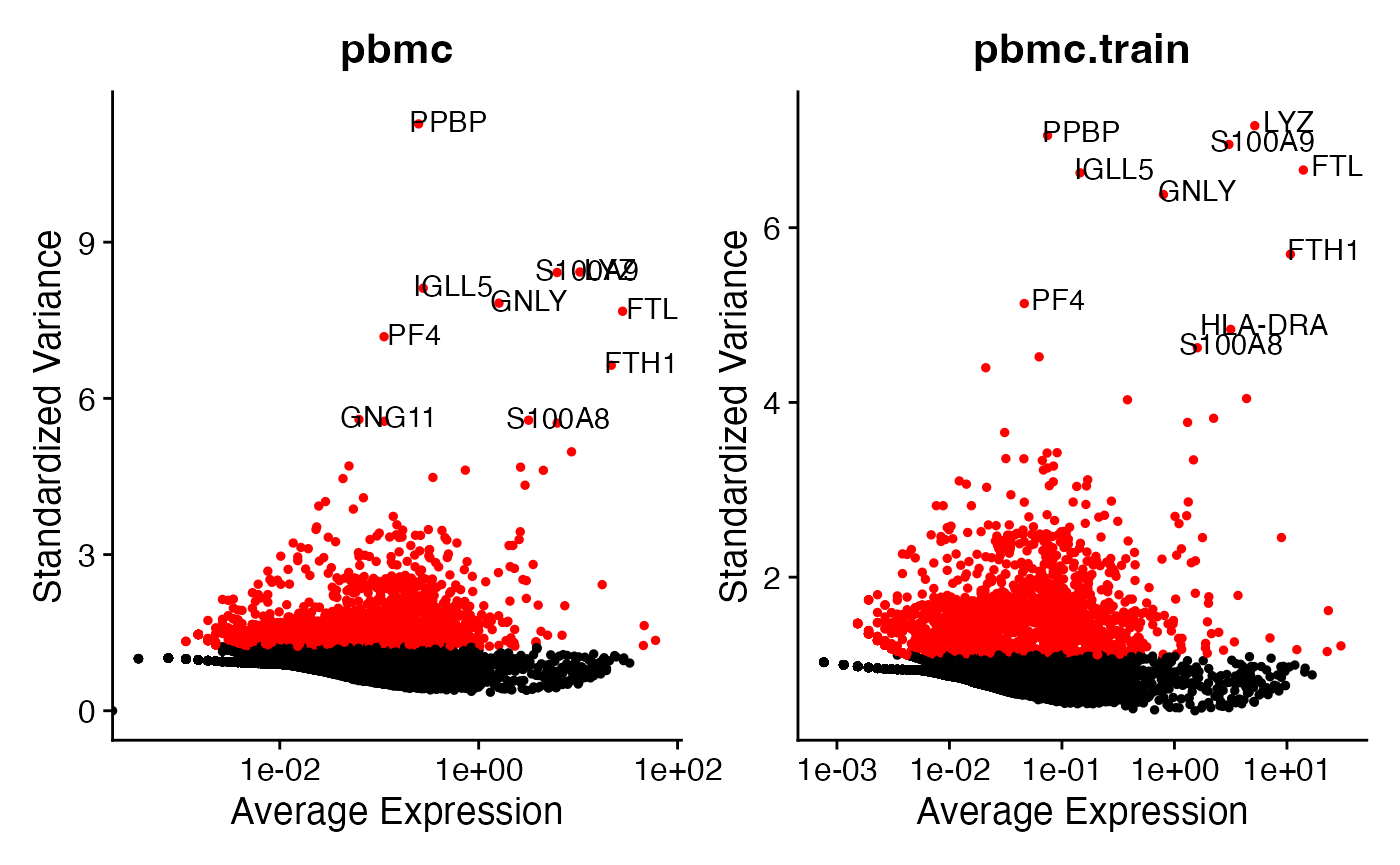
The analysis on pbmc and the analysis on
pbmc.train identify similar sets of genes as the top 10
most highly variable genes. This is comforting, as it shows that the
training set is retaining a lot of info compared to the full dataset.
The overlapping genes are:
PPBP, LYZ, FTL, S100A9, S100A8, GNLY, FTH1, IGLL5, PF4. The
only difference is that on the training set we selected
HLA-DRA instead of GNG11.
sort(top10)
##  [1] "FTH1"   "FTL"    "GNG11"  "GNLY"   "IGLL5"  "LYZ"    "PF4"    "PPBP"
##  [9] "S100A8" "S100A9"
sort(top10.train)
##  [1] "FTH1"    "FTL"     "GNLY"    "HLA-DRA" "IGLL5"   "LYZ"     "PF4"
##  [8] "PPBP"    "S100A8"  "S100A9"
Next, we show that pbmc and pbmc.train have
very similar principal components. This is comforting, as it suggests
that we do not lose too much information when we count split and
estimate principal components on only the training set. Below, we
compare loading plots for the first two principal components for
pbmc and pbmc.train. Note that the
pbmc.train plots have been flipped upside-down compared to
the pbmc plots due to a sign flip of the principal
components (which is unimportant).
p1 <- VizDimLoadings(pbmc, dims = 1, reduction = "pca")+theme(axis.text = element_text(size=7))+ggtitle("pbmc")
p2 <- VizDimLoadings(pbmc, dims = 2, reduction = "pca")+theme(axis.text = element_text(size=7))
p1.train <- VizDimLoadings(pbmc.train, dims = 1, reduction = "pca")+theme(axis.text = element_text(size=7))+ggtitle("pbmc.train")
p2.train <- VizDimLoadings(pbmc.train, dims = 2, reduction = "pca")+theme(axis.text = element_text(size=7))

p1+p1.train+p2+p2.train+plot_layout(nrow=2, ncol=2)
We can see that we obtain very similar principal components on the
training set to those obtained on the full data. On both datasets, PC_1
is dominated by the gene MALAT1 in one direction and genes
like CST3 and TYROBF in the other direction.
(The fact that MALAT1 has a positive loading in
pbmc.train and a negative loading in pbmc is
simply due to a sign flip of the first principal component.) The second
principal component is dominated by CD79A and
HLA-D0A1 and HLA-DOB1, with NKG7
having a lot of importance with the opposite sign. (The sign flip
between the two datasets is once again unimportant.)
Clustering the data
Now that we have seen that the training set is retaining a lot of the
signal of the full dataset, we move on to clustering. As in the Seurat
tutorial, we retain 10 principal components for clustering. While we
will ultimately use clusters from pbmc.train for our count
splitting analysis, in this section we also cluster pbmc so
that we can reproduce the naive analysis from the Seurat tutorial.
pbmc <- FindNeighbors(pbmc, dims = 1:10)
pbmc <- FindClusters(pbmc, resolution=0.5)
pbmc.train <- FindNeighbors(pbmc.train, dims = 1:10)
pbmc.train <- FindClusters(pbmc.train, resolution=0.5)
We first visualize the clusters that we have computed on the training set.
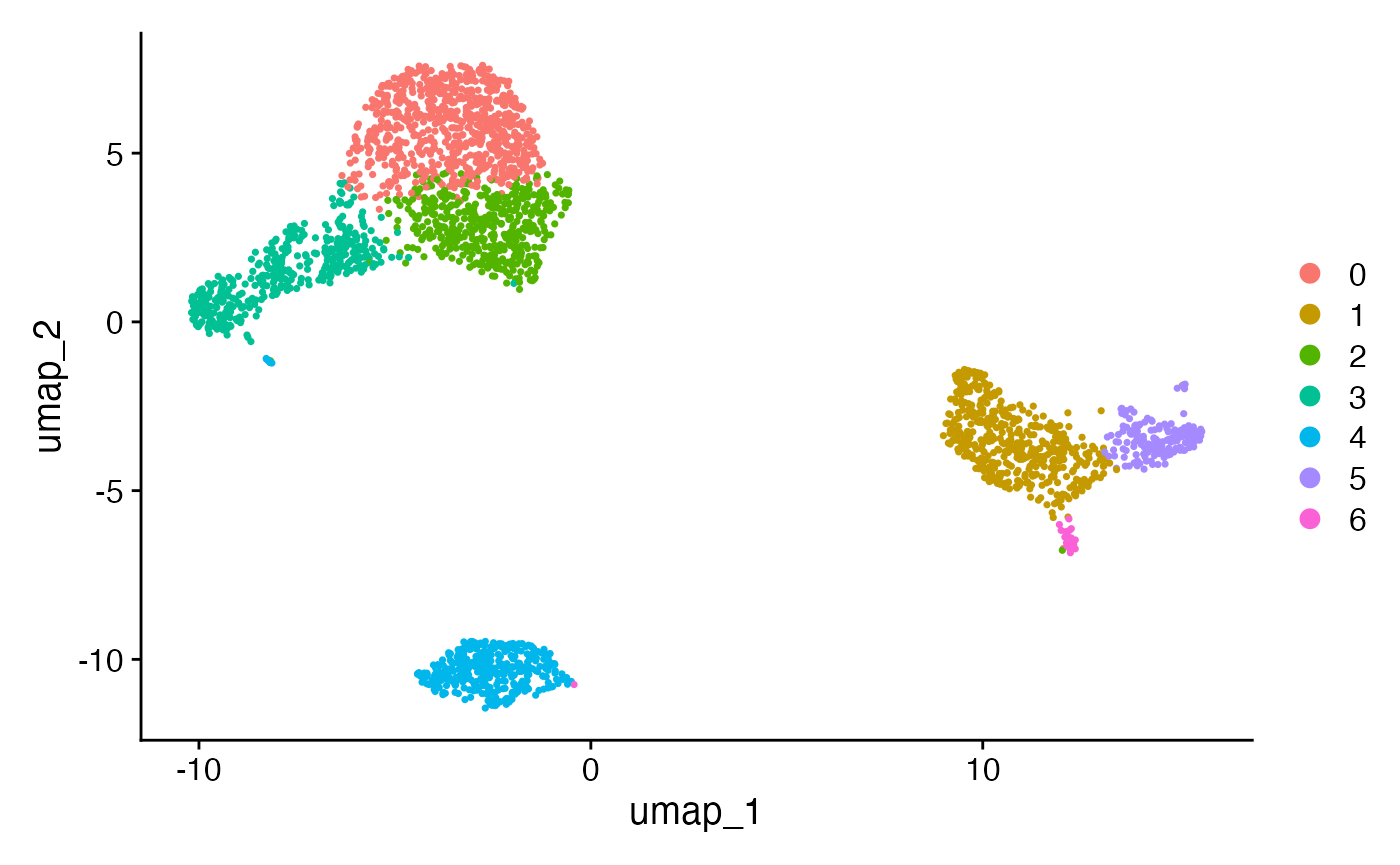
We want to know how similar these clusters are to the ones computed
on pbmc. Looking at two UMAP plots could be potentially
misleading, as the UMAP dimensions on the full dataset are
different than those on the training set. Further complicating
our ability to compare the two clusterings, the training set has
slightly fewer cells in it due to the preprocessing pipeline.
## [1] 2615
length(clusters.full)## [1] 2638To compare the two clusterings, we compute the adjusted Rand index (Hubert and Arabie (1985)) using only the cells that are included in the training set.
clusters.full.subset <- clusters.full[colnames(pbmc.train)]
adjustedRandIndex(clusters.train, clusters.full.subset)
## [1] 0.7711931The high adjusted Rand index shows that the clusters obtained from the training set are similar to those obtained on the test set. The confusion matrix below shows that we can easily map the first 7 clusters on the full data to a corresponding cluster on the training data, and the full data has two additional (small) clusters that seem to have combined with cluster 6 in the training data.
table(clusters.train, clusters.full.subset)## clusters.full.subset
## clusters.train 0 1 2 3 4 5 6 7 8
## 0 619 0 87 0 14 0 0 0 0
## 1 0 460 0 0 0 3 0 1 0
## 2 57 0 382 0 20 0 0 0 0
## 3 0 0 4 1 250 0 154 0 0
## 4 0 0 2 342 1 0 0 2 0
## 5 0 9 0 0 0 159 0 0 7
## 6 0 1 0 0 0 0 0 29 0Overall, in this section, we saw that we get very similar estimated clusters when we use the training data obtained from count splitting compared to using the full data. Once again, this is comforting, as it shows that count splitting did not cause us to miss true signal in the data.
Differential Expression
Finding differentially expressed features “by hand”
Now that we computed clusters from the training set, it is time to
look for differentially expressed genes across the clusters. The
“safest” way to perform this analysis is to extract the cluster labels
from pbmc.train and write our own analysis functions to see
how the columns of Xtestsubset (created above) vary across
these clusters. This approach is the safest because we know for sure
that the clusters were obtained using only the training data and that
the differential expression analysis uses only the test data.
First, we extract the clusters and verify that we have a cluster for
every cell in Xtestsubset.
## [1] 2615
NCOL(Xtestsubset)## [1] 2615As in the Seurat tutorial, we will first test for genes that distinguish cluster 2 from all other clusters. The table in the previous section showed that the training set cluster 2 maps to the full dataset cluster 2. We reproduce the analysis from the Seurat tutorial “by hand” below, both using the “naive method” (which uses the full data for clustering and differential expression testing) and using count splitting.
By default, the FindMarkers() function in the Seurat
package applies a Wilcoxon test for a difference in means to the
log-normalized data. We will use this method below to test for
differential expression, and so we first need to normalize our test
dataset by size factors and log transform it.
## Log normalize the test set
sf.test <- colSums(Xtestsubset)
Xtestsubset_norm <- t(apply(Xtestsubset, 1, function(u) u/sf.test))
Xtestsubset_lognorm <- log(Xtestsubset_norm +1)

## Log normalize the full dataset
Xsubset <- pbmc.counts[rownames(pbmc),colnames(pbmc)]
sf.full <- colSums(Xsubset)
Xsubset_norm <- t(apply(Xsubset, 1, function(u) u/sf.full))
Xsubset_lognorm <- log(Xsubset_norm +1)
### Do the count splitting analysis
cluster2.train <- clusters.train==2
pvals2.countsplit <- apply(Xtestsubset_lognorm, 1, function(u) wilcox.test(u~cluster2.train)$p.value)

### Do the naive method analysis
clusters.full <- Idents(pbmc)
cluster2.full <- clusters.full==2
pvals2.naive <- apply(Xsubset_lognorm, 1, function(u) wilcox.test(u~cluster2.full)$p.value)

head(sort(pvals2.countsplit))
##          LTB         IL32         IL7R         CD3D      HLA-DRA       TYROBP
## 1.024995e-69 2.795907e-65 1.555729e-52 1.822045e-52 2.461172e-50 3.652260e-47
head(sort(pvals2.naive))
##         IL32          LTB         CD3D         IL7R         LDHB          CD2
## 2.892340e-90 1.060121e-86 8.794641e-71 3.516098e-68 1.642480e-67 3.436996e-59
We identify LTB, IL32, CD3D,
and IL7R as the top 4 markers of cluster 2, which is the
same as in the Seurat tutorial (although the order is slightly different
and the p-values are slightly different). While the takeaways of the two
analyses are similar in this case, as explained in our preprint, the naive
method used in the Seurat tutorial leads to artificially low p-values
and an inflated Type 1 error rate, whereas count splitting controls the
Type 1 error rate (under a Poisson assumption).
Finding differentially expressed features using Seurat
It would be nice to store the test set counts inside of our Seurat
object. This would allow us to use some of Seurat’s nice visualization
features for differential expression testing. To do this, we add the
test counts to our pbmc.train object as an additional
assay. We note that care should be taken in this
section: Seurat functions not explicitly mentioned in this
tutorial may have unexpected behavior.
After adding the test counts to pbmc.train as a new
assay, we run the run normalize and scale functions to ensure that we
have appopriate values in the counts, data,
and scale.data slots within the test set assay.
pbmc.train[['test']] <- CreateAssayObject(counts=Xtestsubset)
pbmc.train <- NormalizeData(pbmc.train, assay="test")
pbmc.train <- ScaleData(pbmc.train, assay="test")
We first verify that the Seurat FindMarkers function
returns the same information as the manual differential expression test
above. Note that the FindMarkers() function will
automatically use the clusters computed previously on
Xtrain but will now use the scaled counts within the
test assay to test for differential expression.
cluster2.markers <- FindMarkers(pbmc.train, ident.1=2, min.pct=0, assay="test")

head(sort(pvals2.countsplit), n=10)
##          LTB         IL32         IL7R         CD3D      HLA-DRA       TYROBP
## 1.024995e-69 2.795907e-65 1.555729e-52 1.822045e-52 2.461172e-50 3.652260e-47
##         LDHB     HLA-DPB1     HLA-DRB1         CD74
## 6.409036e-45 1.208847e-43 5.578914e-43 3.876074e-39
head(cluster2.markers, n = 10)
##                 p_val avg_log2FC pct.1 pct.2    p_val_adj
## IL32     2.631737e-78  1.3080923 0.800 0.363 3.268881e-74
## LTB      7.158156e-72  1.3187358 0.904 0.521 8.891146e-68
## IL7R     1.423461e-69  1.3834729 0.575 0.213 1.768081e-65
## TNFRSF4  3.778200e-68  2.9087512 0.124 0.013 4.692902e-64
## CD3D     2.300532e-66  1.0347627 0.758 0.327 2.857490e-62
## CD2      4.187576e-59  1.6089730 0.410 0.154 5.201388e-55
## AQP3     5.163134e-58  2.1402048 0.264 0.066 6.413129e-54
## CD3E     5.376955e-55  1.0875386 0.614 0.273 6.678716e-51
## LDHB     4.651114e-52  0.9870847 0.813 0.439 5.777148e-48
## HLA-DRB1 6.862073e-48 -3.2827168 0.107 0.433 8.523381e-44
We can also verify that the top marker genes selected with count splitting still match up to those obtained from the naive method used in the Seurat tutorial.
head(sort(pvals2.naive), n=10)
##         IL32          LTB         CD3D         IL7R         LDHB          CD2
## 2.892340e-90 1.060121e-86 8.794641e-71 3.516098e-68 1.642480e-67 3.436996e-59
##         AQP3      TNFRSF4         CD3E      HLA-DRA
## 2.966019e-58 1.507652e-54 3.323945e-54 8.921669e-54
head(FindMarkers(pbmc, ident.1=2), n=10)
##                p_val avg_log2FC pct.1 pct.2    p_val_adj
## IL32    2.892340e-90  1.3070772 0.947 0.465 3.966555e-86
## LTB     1.060121e-86  1.3312674 0.981 0.643 1.453850e-82
## CD3D    8.794641e-71  1.0597620 0.922 0.432 1.206097e-66
## IL7R    3.516098e-68  1.4377848 0.750 0.326 4.821977e-64
## LDHB    1.642480e-67  0.9911924 0.954 0.614 2.252497e-63
## CD2     3.436996e-59  1.6306076 0.651 0.245 4.713496e-55
## AQP3    2.966019e-58  2.0893203 0.420 0.111 4.067598e-54
## TNFRSF4 1.507652e-54  3.1921690 0.210 0.025 2.067595e-50
## CD3E    3.323945e-54  1.0287317 0.830 0.410 4.558458e-50
## HLA-DRA 8.921669e-54 -4.0317690 0.342 0.608 1.223518e-49
Comparing visualizations on training set and test set
One reason that it is useful to store the test matrix in a
Seurat object is that it lets us use many visualization
features from the Seurat package.
Consider the following sets of heatmaps. Each individual heatmap plots 500 randomly selected cells, ordered by their coordinates along the specified principal component. The colors in the heatmap represent expression values. The genes with the highest positive loadings and the highest negative loadings are plotted for each principal component. Both sets of heat maps use the principal components computed using the training set, but the expression counts reflected in the heat map are different.
The first set of heatmaps displays expression counts from the training set. While the association between the genes and the principal components clearly decreases as we move from PC1 to PC15, PC15 still clearly shows association between the top genes and the PC. This association is due to the fact that the training data itself was used to construct the PCs, and so there will always be some genes that appear to be associated with the PC.
DimHeatmap(pbmc.train, dims = 1:15, cells = 500, balanced = TRUE, nfeatures=10)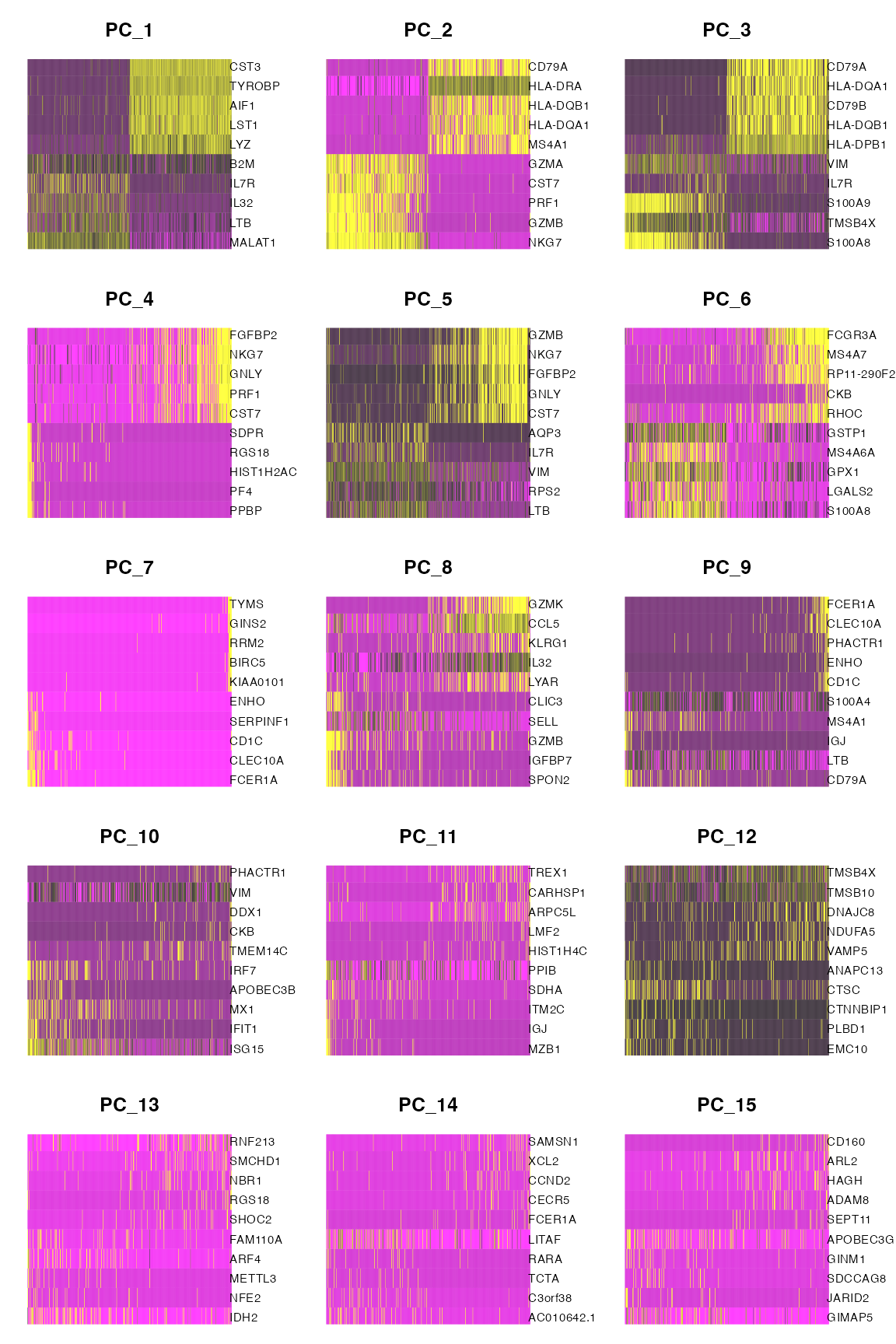
The following plot still shows principal components computed on the training set, but the expression count values inside of the heat map are now test set counts. For the first 6 or so PCs, the association between test set counts and the PC seems almost as strong as the association between the training set counts and the PCs. This suggests that these PCs are measuring true signal in the data. On the other hand, consider the PCs 10-15. The patterns seen in the training set essentially disappear in the top genes plotted for the test set. This suggests that any association seen in the initial heatmaps was due to overfitting; these PCs are mostly driven by noise in the data.
DimHeatmap(pbmc.train, dims = 1:15, cells = 500, balanced = TRUE, nfeatures=10, assay="test")
Our results using count splitting line up with insights from the Seurat tutorial obtained using Jackstraw (Chung and Storey (2015)): the original Seurat tutorial suggested that it would be reasonable to keep 7-12 PCs, and chose to keep 10 PCs. However, Jackstraw requires re-computing PCs for many permuted versions of the data, while our heatmaps obtained using count splitting requires only a single principal component calculation. This highlights the fact that count splitting can be useful when determining how many principal components to retain for analysis.